Quick Reference for AI Agents & Developers
Report incorrect code
Copy
Ask AI
import { CometChatThemeProvider } from "@cometchat/chat-uikit-react-native";
// Style individual components via theme
<CometChatThemeProvider
theme={{
light: {
conversationStyles: {
itemStyle: {
avatarStyle: {
containerStyle: { borderRadius: 8, backgroundColor: "#FBAA75" },
},
},
},
},
}}
>
<CometChatConversations />
</CometChatThemeProvider>
- Theme Provider → CometChatThemeProvider
- Colors → Colors
- Message Bubble Styling → Message Bubble Styling
Overview
CometChat UIKit enables developers to seamlessly integrate customizable components into their applications. Each component is designed to ensure a consistent user experience while offering flexibility to adapt to your app’s design system. You can modify attributes such as colors, fonts, sizes, icons, and more using XML or programmatically. Below is a detailed guide for styling individual components within the UIKit.Components
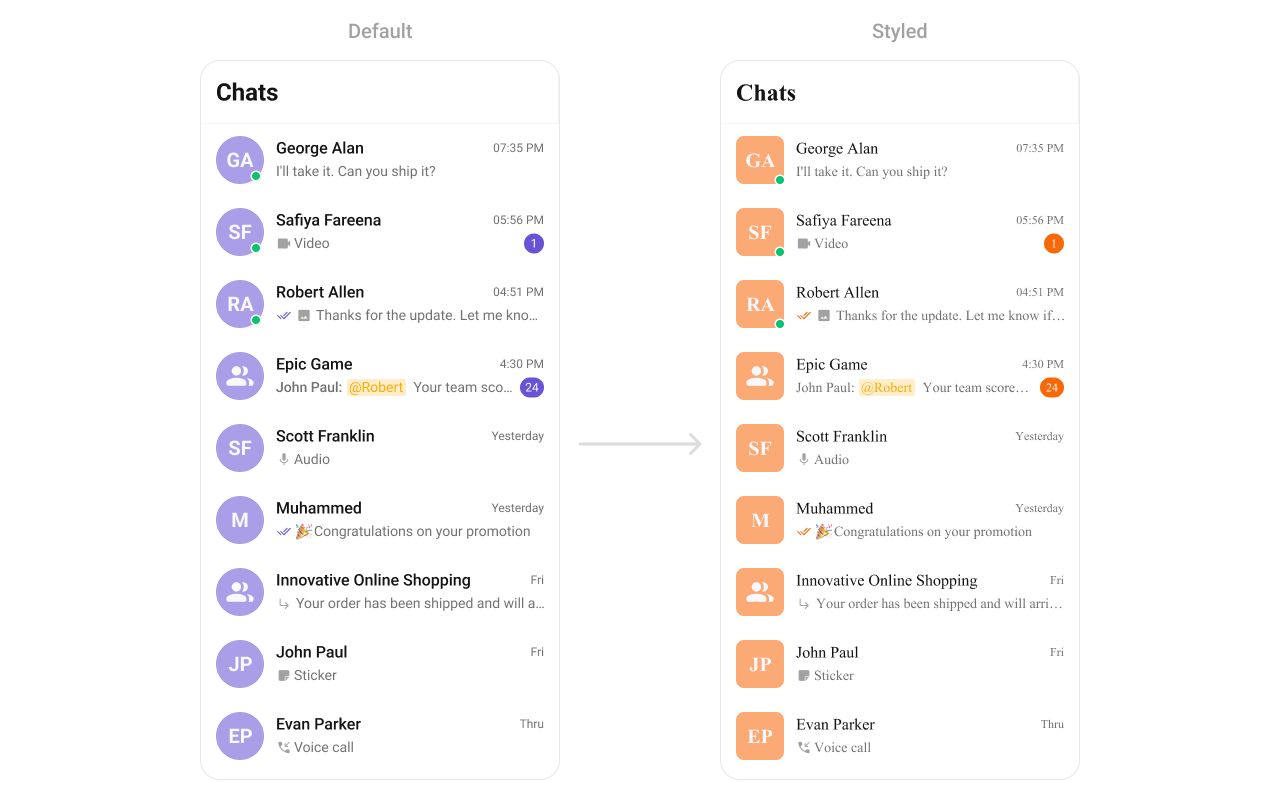
Conversations
TheCometChatConversations Component provides a list of recent chats, showing participants, message previews, and timestamps. It supports default themes while offering deep customization for text appearance, icons, and overall layout. With this component, you can create an intuitive and visually appealing chat list that matches your app’s branding.
- TypeScript
- JavaScript
Report incorrect code
Copy
Ask AI
import {
CometChatConversations,
CometChatUIKit,
CometChatThemeProvider,
} from "@cometchat/chat-uikit-react-native";
// other code
return (
<SafeAreaView style={{ flex: 1 }}>
<CometChatThemeProvider
theme={{
light: {
typography: {
heading4: {
bold: {
fontFamily: "TimesNewRoman-Bold",
},
medium: {
fontFamily: "TimesNewRoman",
},
regular: {
fontFamily: "TimesNewRoman",
},
},
},
conversationStyles: {
itemStyle: {
avatarStyle: {
containerStyle: {
borderRadius: 8,
backgroundColor: "#FBAA75",
},
imageStyle: {
borderRadius: 8,
},
},
},
},
},
}}
>
{loggedIn && <CometChatConversations></CometChatConversations>}
</CometChatThemeProvider>
</SafeAreaView>
);
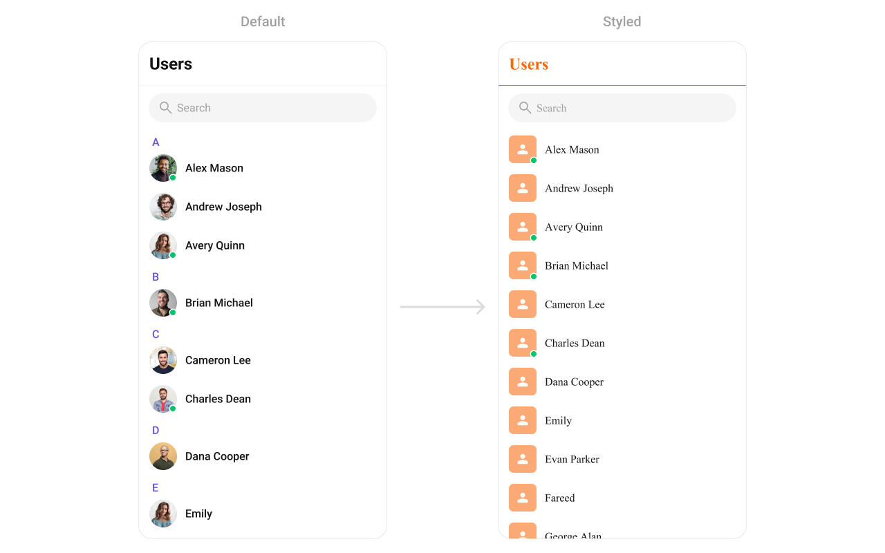
Users
TheCometChatUsers Component displays a scrollable list of users. It is ideal for showcasing available contacts for messaging, calls, or group creation. Developers can style elements like user avatars, status indicators, and list backgrounds to align with their design guidelines.
- TypeScript
- JavaScript
Report incorrect code
Copy
Ask AI
import {
CometChatUsers,
CometChatThemeProvider,
} from "@cometchat/chat-uikit-react-native";
// other code
return (
<SafeAreaView style={{ flex: 1 }}>
<CometChatThemeProvider
theme={{
light: {
typography: {
heading4: {
bold: {
fontFamily: "TimesNewRoman-Bold",
},
medium: {
fontFamily: "TimesNewRoman",
},
regular: {
fontFamily: "TimesNewRoman",
},
},
},
userStyles: {
titleStyle: {
color: "#FBAA75",
},
titleSeparatorStyle: {
borderBottomColor: "#FBAA75",
},
itemStyle: {
avatarStyle: {
containerStyle: {
borderRadius: 8,
backgroundColor: "#FBAA75",
},
imageStyle: {
borderRadius: 8,
},
},
},
},
},
}}
>
{loggedIn && <CometChatUsers showLetterHeader={false}></CometChatUsers>}
</CometChatThemeProvider>
</SafeAreaView>
);
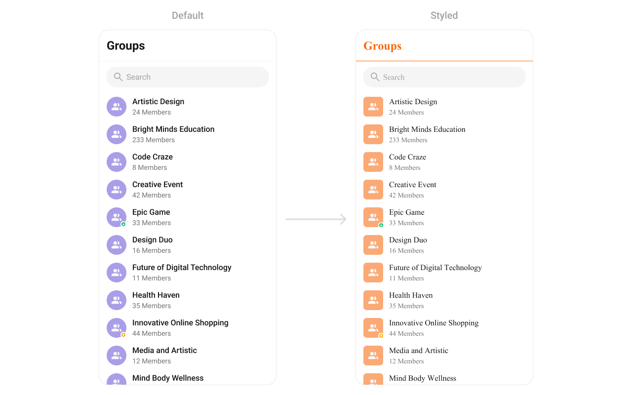
Groups
TheCometChatGroups Component allows you to display and interact with chat groups. Each group item highlights key details like the group name, participant count, and last active time. Customization options include avatar styles, fonts, borders, and background colors, ensuring the component blends seamlessly with your app.
- TypeScript
- JavaScript
Report incorrect code
Copy
Ask AI
import {
CometChatGroups,
CometChatThemeProvider,
} from "@cometchat/chat-uikit-react-native";
// other code
return (
<SafeAreaView style={{ flex: 1 }}>
<CometChatThemeProvider
theme={{
light: {
typography: {
heading4: {
bold: {
fontFamily: "TimesNewRoman-Bold",
},
medium: {
fontFamily: "TimesNewRoman",
},
regular: {
fontFamily: "TimesNewRoman",
},
},
},
groupStyles: {
titleStyle: {
color: "#FBAA75",
},
titleSeparatorStyle: {
borderBottomColor: "#FBAA75",
},
itemStyle: {
avatarStyle: {
containerStyle: {
borderRadius: 8,
backgroundColor: "#FBAA75",
},
imageStyle: {
borderRadius: 8,
},
},
},
},
},
}}
>
{loggedIn && <CometChatGroups></CometChatGroups>}
</CometChatThemeProvider>
</SafeAreaView>
);
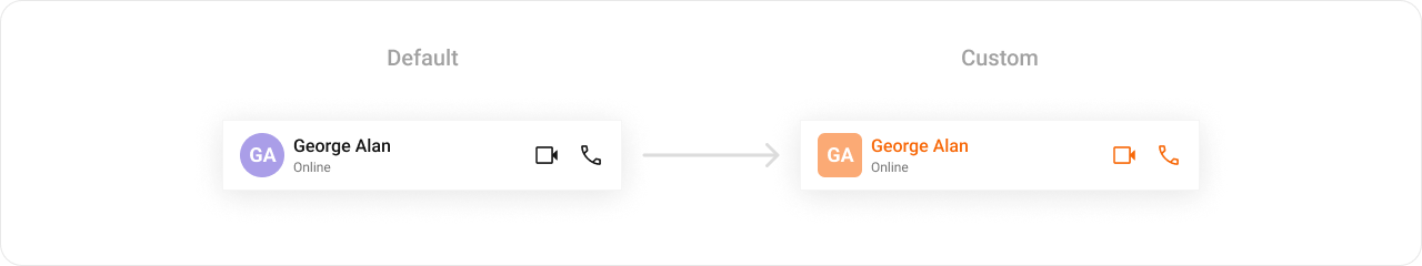
Message Header
TheCometChatMessageHeader Component provides essential information about the active chat, such as the recipient’s name, avatar, and status (online/offline). It often includes options like back navigation, search, or menu buttons. Customization options allow you to style the header background, text appearance, and icons to match your app’s overall design.
- TypeScript
- JavaScript
Report incorrect code
Copy
Ask AI
import {
CometChatConversations,
CometChatMessageHeader,
CometChatThemeProvider,
CometChatUiKitConstants,
} from "@cometchat/chat-uikit-react-native";
import { CometChat } from "@cometchat/chat-sdk-react-native";
// other code
return (
<SafeAreaView style={{ flex: 1 }}>
<CometChatThemeProvider
theme={{
light: {
typography: {
heading4: {
bold: {
fontFamily: "TimesNewRoman-Bold",
},
medium: {
fontFamily: "TimesNewRoman",
},
regular: {
fontFamily: "TimesNewRoman",
},
},
},
messageHeaderStyles: {
titleTextStyle: {
color: "#F76808",
},
avatarStyle: {
containerStyle: {
borderRadius: 8,
backgroundColor: "#FBAA75",
},
},
callButtonStyle: {
audioCallButtonIconStyle: {
tintColor: "#F76808",
},
videoCallButtonIconStyle: {
tintColor: "#F76808",
},
},
},
},
}}
>
{loggedIn && (
<View style={{ flex: 1 }}>
<CometChatConversations
style={{
containerStyle: {
display: messageUser || messageGroup ? "none" : "flex",
},
}}
onItemPress={(item: CometChat.Conversation) => {
if (
item.getConversationType() ==
CometChatUiKitConstants.ConversationTypeConstants.user
) {
setMessageUser(item.getConversationWith() as CometChat.User);
return;
}
setMessageGroup(item.getConversationWith() as CometChat.Group);
}}
></CometChatConversations>
{(messageUser || messageGroup) && (
<CometChatMessageHeader
user={messageUser}
group={messageGroup}
></CometChatMessageHeader>
)}
</View>
)}
</CometChatThemeProvider>
</SafeAreaView>
);
Report incorrect code
Copy
Ask AI
import {
CometChatConversations,
CometChatMessageHeader,
CometChatThemeProvider,
CometChatUiKitConstants,
} from "@cometchat/chat-uikit-react-native";
import { CometChat } from "@cometchat/chat-sdk-react-native";
// other code
return (
<SafeAreaView style={{ flex: 1 }}>
<CometChatThemeProvider
theme={{
light: {
typography: {
heading4: {
bold: {
fontFamily: "TimesNewRoman-Bold",
},
medium: {
fontFamily: "TimesNewRoman",
},
regular: {
fontFamily: "TimesNewRoman",
},
},
},
messageHeaderStyles: {
titleTextStyle: {
color: "#F76808",
},
avatarStyle: {
containerStyle: {
borderRadius: 8,
backgroundColor: "#FBAA75",
},
},
callButtonStyle: {
audioCallButtonIconStyle: {
tintColor: "#F76808",
},
videoCallButtonIconStyle: {
tintColor: "#F76808",
},
},
},
},
}}
>
{loggedIn && (
<View style={{ flex: 1 }}>
<CometChatConversations
style={{
containerStyle: {
display: messageUser || messageGroup ? "none" : "flex",
},
}}
onItemPress={(item) => {
if (
item.getConversationType() ==
CometChatUiKitConstants.ConversationTypeConstants.user
) {
setMessageUser(item.getConversationWith());
return;
}
setMessageGroup(item.getConversationWith());
}}
></CometChatConversations>
{(messageUser || messageGroup) && (
<CometChatMessageHeader
user={messageUser}
group={messageGroup}
></CometChatMessageHeader>
)}
</View>
)}
</CometChatThemeProvider>
</SafeAreaView>
);
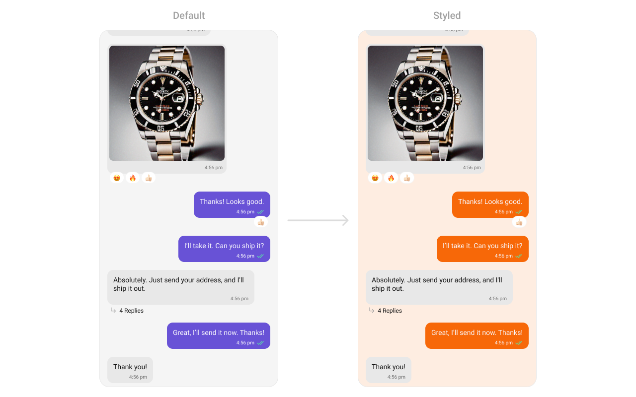
Message List
TheCometChatMessageList Component displays the sequence of messages in a conversation, supporting text, media, reactions, and more. It includes smooth scrolling, timestamps, and grouping for better readability. Developers can customize bubble colors, text appearance, timestamps, and alignment to provide a tailored chat experience.
- TypeScript
- JavaScript
Report incorrect code
Copy
Ask AI
import {
CometChatConversations,
CometChatMessageList,
CometChatThemeProvider,
CometChatUiKitConstants,
} from "@cometchat/chat-uikit-react-native";
import { CometChat } from "@cometchat/chat-sdk-react-native";
// other code
return (
<SafeAreaView style={{ flex: 1 }}>
<CometChatThemeProvider
theme={{
light: {
typography: {
heading4: {
bold: {
fontFamily: "TimesNewRoman-Bold",
},
medium: {
fontFamily: "TimesNewRoman",
},
regular: {
fontFamily: "TimesNewRoman",
},
},
},
messageListStyles: {
containerStyle: {
backgroundColor: "#FEEDE1",
},
outgoingMessageBubbleStyles: {
containerStyle: {
backgroundColor: "#F76808",
},
},
},
},
}}
>
{loggedIn && (
<View style={{ flex: 1 }}>
<CometChatConversations
style={{
containerStyle: {
display: messageUser || messageGroup ? "none" : "flex",
},
}}
onItemPress={(item: CometChat.Conversation) => {
if (
item.getConversationType() ==
CometChatUiKitConstants.ConversationTypeConstants.user
) {
setMessageUser(item.getConversationWith() as CometChat.User);
return;
}
setMessageGroup(item.getConversationWith() as CometChat.Group);
}}
></CometChatConversations>
{(messageUser || messageGroup) && (
<CometChatMessageList
user={messageUser}
group={messageGroup}
></CometChatMessageList>
)}
</View>
)}
</CometChatThemeProvider>
</SafeAreaView>
);
Report incorrect code
Copy
Ask AI
import {
CometChatConversations,
CometChatMessageList,
CometChatThemeProvider,
CometChatUiKitConstants,
} from "@cometchat/chat-uikit-react-native";
import { CometChat } from "@cometchat/chat-sdk-react-native";
// other code
return (
<SafeAreaView style={{ flex: 1 }}>
<CometChatThemeProvider
theme={{
light: {
typography: {
heading4: {
bold: {
fontFamily: "TimesNewRoman-Bold",
},
medium: {
fontFamily: "TimesNewRoman",
},
regular: {
fontFamily: "TimesNewRoman",
},
},
},
messageListStyles: {
containerStyle: {
backgroundColor: "#FEEDE1",
},
outgoingMessageBubbleStyles: {
containerStyle: {
backgroundColor: "#F76808",
},
},
},
},
}}
>
{loggedIn && (
<View style={{ flex: 1 }}>
<CometChatConversations
style={{
containerStyle: {
display: messageUser || messageGroup ? "none" : "flex",
},
}}
onItemPress={(item) => {
if (
item.getConversationType() ==
CometChatUiKitConstants.ConversationTypeConstants.user
) {
setMessageUser(item.getConversationWith());
return;
}
setMessageGroup(item.getConversationWith());
}}
></CometChatConversations>
{(messageUser || messageGroup) && (
<CometChatMessageList
user={messageUser}
group={messageGroup}
></CometChatMessageList>
)}
</View>
)}
</CometChatThemeProvider>
</SafeAreaView>
);
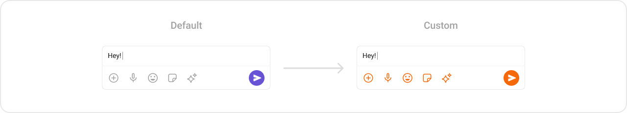
Message Composer
TheCometChatMessageComposer Component enables users to compose and send messages, including text, attachments, and stickers. This highly interactive component supports customization of input box styles, button appearances, and interaction feedback, ensuring it blends seamlessly with your app’s chat UI.
- TypeScript
- JavaScript
Report incorrect code
Copy
Ask AI
import {
CometChatConversations,
CometChatMessageComposer,
CometChatThemeProvider,
CometChatUiKitConstants,
StickerIcon,
} from "@cometchat/chat-uikit-react-native";
import { CometChat } from "@cometchat/chat-sdk-react-native";
// other code
return (
<SafeAreaView style={{ flex: 1 }}>
<CometChatThemeProvider
theme={{
light: {
typography: {
heading4: {
bold: {
fontFamily: "TimesNewRoman-Bold",
},
medium: {
fontFamily: "TimesNewRoman",
},
regular: {
fontFamily: "TimesNewRoman",
},
},
},
messageComposerStyles: {
voiceRecordingIconStyle: {
tintColor: "#F76808",
},
attachmentIconStyle: {
tintColor: "#F76808",
},
sendIconContainerStyle: {
backgroundColor: "#F76808",
},
stickerIcon: {
inactive: (
<StickerIcon
height={24}
width={24}
color="#F76808"
></StickerIcon>
),
},
},
},
}}
>
{loggedIn && (
<View style={{ flex: 1 }}>
<CometChatConversations
style={{
containerStyle: {
display: messageUser || messageGroup ? "none" : "flex",
},
}}
onItemPress={(item: CometChat.Conversation) => {
if (
item.getConversationType() ==
CometChatUiKitConstants.ConversationTypeConstants.user
) {
setMessageUser(item.getConversationWith() as CometChat.User);
return;
}
setMessageGroup(item.getConversationWith() as CometChat.Group);
}}
></CometChatConversations>
{(messageUser || messageGroup) && (
<CometChatMessageComposer
user={messageUser}
group={messageGroup}
></CometChatMessageComposer>
)}
</View>
)}
</CometChatThemeProvider>
</SafeAreaView>
);
Report incorrect code
Copy
Ask AI
import {
CometChatConversations,
CometChatMessageComposer,
CometChatThemeProvider,
CometChatUiKitConstants,
StickerIcon,
} from "@cometchat/chat-uikit-react-native";
import { CometChat } from "@cometchat/chat-sdk-react-native";
// other code
return (
<SafeAreaView style={{ flex: 1 }}>
<CometChatThemeProvider
theme={{
light: {
typography: {
heading4: {
bold: {
fontFamily: "TimesNewRoman-Bold",
},
medium: {
fontFamily: "TimesNewRoman",
},
regular: {
fontFamily: "TimesNewRoman",
},
},
},
messageComposerStyles: {
voiceRecordingIconStyle: {
tintColor: "#F76808",
},
attachmentIconStyle: {
tintColor: "#F76808",
},
sendIconContainerStyle: {
backgroundColor: "#F76808",
},
stickerIcon: {
inactive: (
<StickerIcon
height={24}
width={24}
color="#F76808"
></StickerIcon>
),
},
},
},
}}
>
{loggedIn && (
<View style={{ flex: 1 }}>
<CometChatConversations
style={{
containerStyle: {
display: messageUser || messageGroup ? "none" : "flex",
},
}}
onItemPress={(item) => {
if (
item.getConversationType() ==
CometChatUiKitConstants.ConversationTypeConstants.user
) {
setMessageUser(item.getConversationWith());
return;
}
setMessageGroup(item.getConversationWith());
}}
></CometChatConversations>
{(messageUser || messageGroup) && (
<CometChatMessageComposer
user={messageUser}
group={messageGroup}
></CometChatMessageComposer>
)}
</View>
)}
</CometChatThemeProvider>
</SafeAreaView>
);
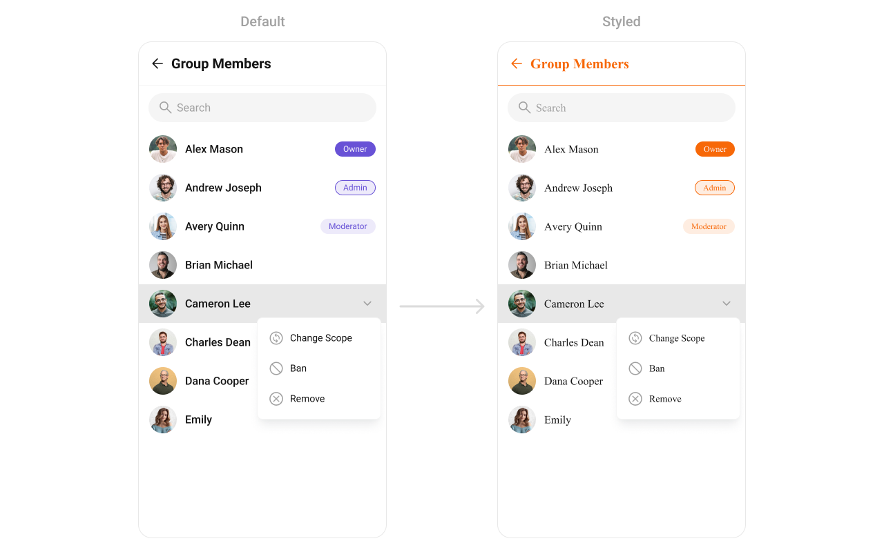
Group Members
TheCometChatGroupMembers Component lists participants in a chat group with details like names, avatars, and roles (e.g., admin or member). It supports customizable styles for list items, fonts, and background colors, ensuring it integrates with your app’s group management interface.
- TypeScript
- JavaScript
Report incorrect code
Copy
Ask AI
import {
CometChatConversations,
CometChatGroupMembers,
CometChatThemeProvider,
} from "@cometchat/chat-uikit-react-native";
import { CometChat } from "@cometchat/chat-sdk-react-native";
// other code
return (
<SafeAreaView style={{ flex: 1 }}>
<CometChatThemeProvider
theme={{
light: {
color: {
primary: "#F76808",
},
typography: {
heading4: {
bold: {
fontFamily: "TimesNewRoman-Bold",
},
medium: {
fontFamily: "TimesNewRoman",
},
regular: {
fontFamily: "TimesNewRoman",
},
},
},
groupMemberStyle: {
titleSeparatorStyle: {
borderBottomColor: "#F76808",
},
titleStyle: {
color: "#F76808",
},
backButtonIconStyle: {
tintColor: "#F76808",
},
},
},
}}
>
{loggedIn && (
<View style={{ flex: 1 }}>
<CometChatConversations
style={{
containerStyle: {
display: messageUser || messageGroup ? "none" : "flex",
},
}}
conversationsRequestBuilder={new CometChat.ConversationsRequestBuilder()
.setConversationType("group")
.setLimit(30)}
onItemPress={(item: CometChat.Conversation) => {
setMessageGroup(item.getConversationWith() as CometChat.Group);
}}
></CometChatConversations>
{messageGroup && (
<CometChatGroupMembers
group={messageGroup!}
></CometChatGroupMembers>
)}
</View>
)}
</CometChatThemeProvider>
</SafeAreaView>
);
Report incorrect code
Copy
Ask AI
import {
CometChatConversations,
CometChatGroupMembers,
CometChatThemeProvider,
} from "@cometchat/chat-uikit-react-native";
import { CometChat } from "@cometchat/chat-sdk-react-native";
// other code
return (
<SafeAreaView style={{ flex: 1 }}>
<CometChatThemeProvider
theme={{
light: {
color: {
primary: "#F76808",
},
typography: {
heading4: {
bold: {
fontFamily: "TimesNewRoman-Bold",
},
medium: {
fontFamily: "TimesNewRoman",
},
regular: {
fontFamily: "TimesNewRoman",
},
},
},
groupMemberStyle: {
titleSeparatorStyle: {
borderBottomColor: "#F76808",
},
titleStyle: {
color: "#F76808",
},
backButtonIconStyle: {
tintColor: "#F76808",
},
},
},
}}
>
{loggedIn && (
<View style={{ flex: 1 }}>
<CometChatConversations
style={{
containerStyle: {
display: messageUser || messageGroup ? "none" : "flex",
},
}}
conversationsRequestBuilder={new CometChat.ConversationsRequestBuilder()
.setConversationType("group")
.setLimit(30)}
onItemPress={(item) => {
setMessageGroup(item.getConversationWith());
}}
></CometChatConversations>
{messageGroup && (
<CometChatGroupMembers
group={messageGroup}
></CometChatGroupMembers>
)}
</View>
)}
</CometChatThemeProvider>
</SafeAreaView>
);
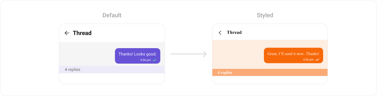
Thread Header
TheCometChatThreadHeader is used in threaded message views, displaying information about the parent message and its context. It provides a seamless way to navigate between the thread and the main conversation while maintaining context.
- TypeScript
- JavaScript
Report incorrect code
Copy
Ask AI
import {
CometChatConversations,
CometChatMessageHeader,
CometChatMessageList,
CometChatMessageComposer,
CometChatThemeProvider,
CometChatThreadHeader,
CometChatUiKitConstants,
} from "@cometchat/chat-uikit-react-native";
import { CometChat } from "@cometchat/chat-sdk-react-native";
// other code
return (
<SafeAreaView style={{ flex: 1 }}>
<CometChatThemeProvider
theme={{
light: {
typography: {
heading4: {
bold: {
fontFamily: "TimesNewRoman-Bold",
},
medium: {
fontFamily: "TimesNewRoman",
},
regular: {
fontFamily: "TimesNewRoman",
},
},
},
threadHeaderStyles: {
containerStyle: {
backgroundColor: "#FEEDE1",
},
messageBubbleContainerStyle: {
backgroundColor: "#FEEDE1",
},
replyCountBarStyle: {
backgroundColor: "#FBA46B",
},
replyCountTextStyle: {
color: "#FFFFFF",
},
outgoingMessageBubbleStyles: {
containerStyle: {
backgroundColor: "#F76808",
},
},
},
},
}}
>
{loggedIn && (
<View style={{ flex: 1 }}>
<CometChatConversations
style={{
containerStyle: {
display: messageUser || messageGroup ? "none" : "flex",
},
}}
onItemPress={(item: CometChat.Conversation) => {
if (
item.getConversationType() ==
CometChatUiKitConstants.ConversationTypeConstants.user
) {
setMessageUser(item.getConversationWith() as CometChat.User);
return;
}
setMessageGroup(item.getConversationWith() as CometChat.Group);
}}
></CometChatConversations>
{(messageUser || messageGroup) && !parentMessage && (
<>
<CometChatMessageHeader
user={messageUser}
group={messageGroup}
></CometChatMessageHeader>
<CometChatMessageList
user={messageUser}
group={messageGroup}
onThreadRepliesPress={(
msg: CometChat.BaseMessage,
view: any
) => {
setParentMessage(msg);
}}
></CometChatMessageList>
<CometChatMessageComposer
user={messageUser}
group={messageGroup}
></CometChatMessageComposer>
</>
)}
{(messageUser || messageGroup) && parentMessage && (
<CometChatThreadHeader
parentMessage={parentMessage}
></CometChatThreadHeader>
)}
</View>
)}
</CometChatThemeProvider>
</SafeAreaView>
);
Report incorrect code
Copy
Ask AI
import {
CometChatConversations,
CometChatMessageHeader,
CometChatMessageList,
CometChatMessageComposer,
CometChatThemeProvider,
CometChatThreadHeader,
CometChatUiKitConstants,
} from "@cometchat/chat-uikit-react-native";
import { CometChat } from "@cometchat/chat-sdk-react-native";
// other code
return (
<SafeAreaView style={{ flex: 1 }}>
<CometChatThemeProvider
theme={{
light: {
typography: {
heading4: {
bold: {
fontFamily: "TimesNewRoman-Bold",
},
medium: {
fontFamily: "TimesNewRoman",
},
regular: {
fontFamily: "TimesNewRoman",
},
},
},
threadHeaderStyles: {
containerStyle: {
backgroundColor: "#FEEDE1",
},
messageBubbleContainerStyle: {
backgroundColor: "#FEEDE1",
},
replyCountBarStyle: {
backgroundColor: "#FBA46B",
},
replyCountTextStyle: {
color: "#FFFFFF",
},
outgoingMessageBubbleStyles: {
containerStyle: {
backgroundColor: "#F76808",
},
},
},
},
}}
>
{loggedIn && (
<View style={{ flex: 1 }}>
<CometChatConversations
style={{
containerStyle: {
display: messageUser || messageGroup ? "none" : "flex",
},
}}
onItemPress={(item) => {
if (
item.getConversationType() ==
CometChatUiKitConstants.ConversationTypeConstants.user
) {
setMessageUser(item.getConversationWith());
return;
}
setMessageGroup(item.getConversationWith());
}}
></CometChatConversations>
{(messageUser || messageGroup) && !parentMessage && (
<>
<CometChatMessageHeader
user={messageUser}
group={messageGroup}
></CometChatMessageHeader>
<CometChatMessageList
user={messageUser}
group={messageGroup}
onThreadRepliesPress={(msg, view) => {
setParentMessage(msg);
}}
></CometChatMessageList>
<CometChatMessageComposer
user={messageUser}
group={messageGroup}
></CometChatMessageComposer>
</>
)}
{(messageUser || messageGroup) && parentMessage && (
<CometChatThreadHeader
parentMessage={parentMessage}
></CometChatThreadHeader>
)}
</View>
)}
</CometChatThemeProvider>
</SafeAreaView>
);
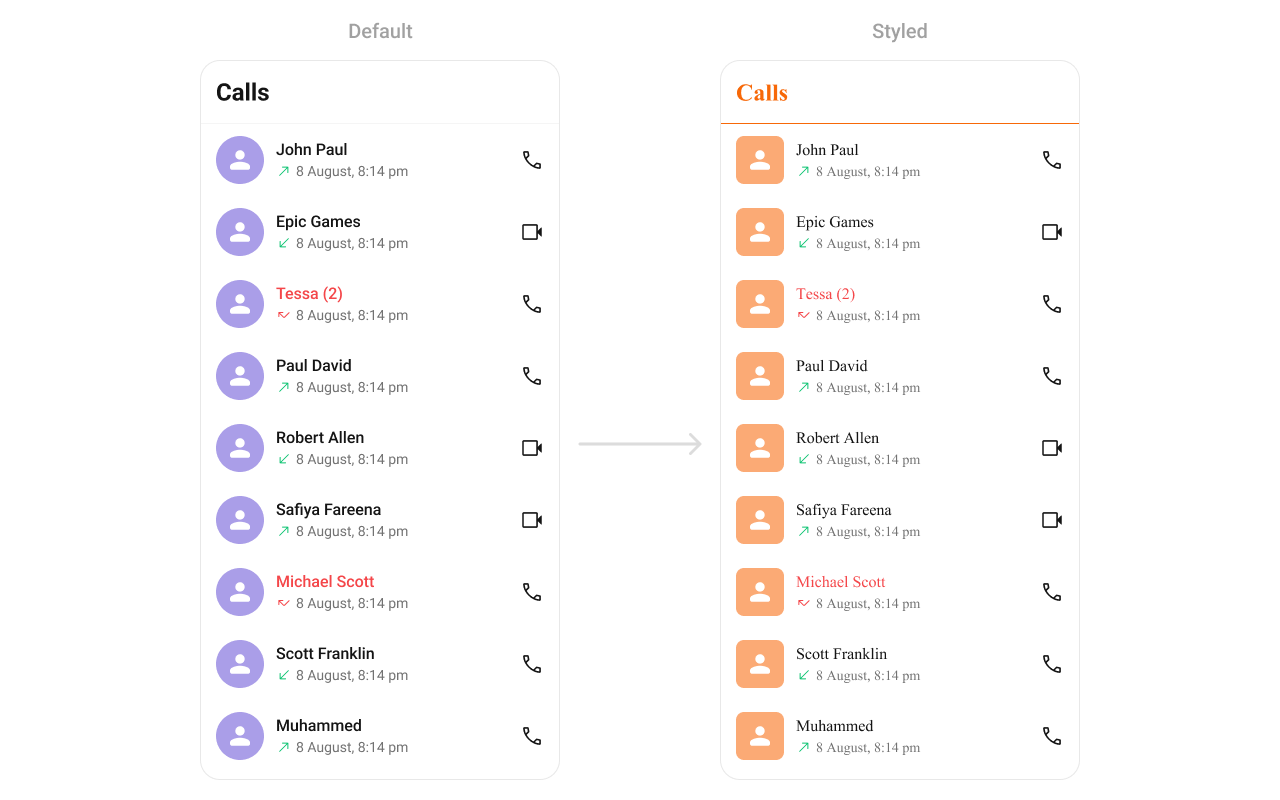
Call Logs
TheCometChatCallLogs Component provides a list of recent calls (voice or video), showing details like call type, duration, participants, and timestamps. Developers can style text, icons, and background elements, making it easy to match the app’s design system.
- TypeScript
- JavaScript
Report incorrect code
Copy
Ask AI
import {
CometChatCallLogs,
CometChatThemeProvider,
} from "@cometchat/chat-uikit-react-native";
// other code
return (
<SafeAreaView style={{ flex: 1 }}>
<CometChatThemeProvider
theme={{
light: {
typography: {
heading4: {
bold: {
fontFamily: "TimesNewRoman-Bold",
},
medium: {
fontFamily: "TimesNewRoman",
},
regular: {
fontFamily: "TimesNewRoman",
},
},
},
callLogsStyles: {
titleSeparatorStyle: {
borderBottomColor: "#F76808",
},
titleTextStyle: {
color: "#F76808",
},
itemStyle: {
avatarStyle: {
containerStyle: {
borderRadius: 8,
backgroundColor: "#FBAA75",
},
imageStyle: {
borderRadius: 8,
},
},
},
},
},
}}
>
{loggedIn && (
<View style={{ flex: 1 }}>
<CometChatCallLogs></CometChatCallLogs>
</View>
)}
</CometChatThemeProvider>
</SafeAreaView>
);
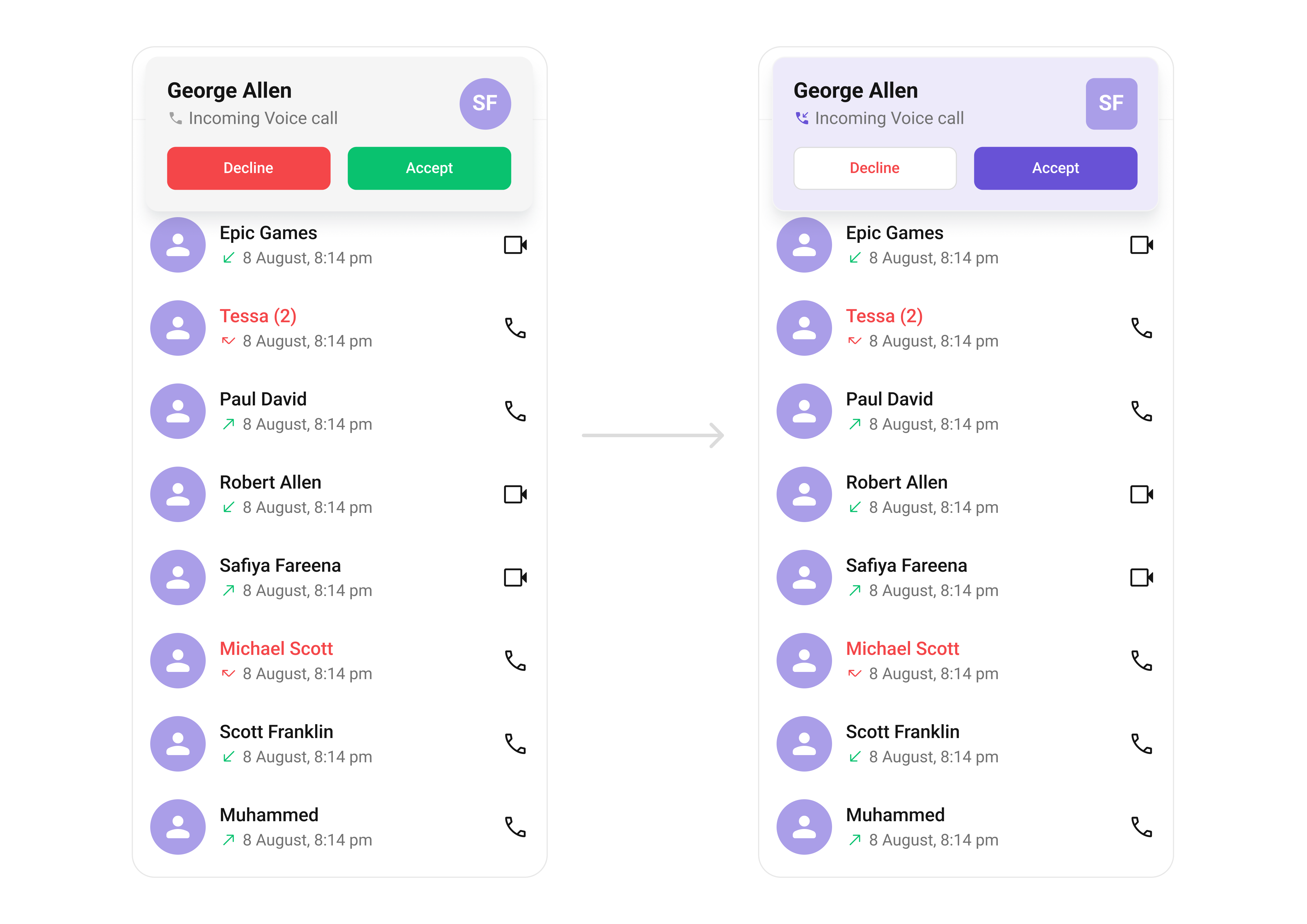
Incoming Call
TheCometChatIncomingCall component displays a notification for an incoming call. It typically includes caller details like name, avatar, and call type (audio/video), along with buttons to accept or decline the call.
- TypeScript
- JavaScript
Report incorrect code
Copy
Ask AI
import {
CometChatIncomingCall,
CometChatThemeProvider,
useTheme,
} from "@cometchat/chat-uikit-react-native";
// other code
const theme = useTheme();
return (
<SafeAreaView style={{ flex: 1 }}>
<CometChatThemeProvider
theme={{
light: {
typography: {
heading4: {
bold: {
fontFamily: "TimesNewRoman-Bold",
},
medium: {
fontFamily: "TimesNewRoman",
},
regular: {
fontFamily: "TimesNewRoman",
},
},
},
incomingCallStyle: {
containerStyle: {
backgroundColor: theme.color.extendedPrimary100,
},
avatarStyle: {
containerStyle: {
backgroundColor: theme.color.extendedPrimary500,
borderRadius: 8,
},
imageStyle: {
borderRadius: 8,
},
},
declineCallButtonStyle: {
backgroundColor: theme.color.staticWhite,
},
declineCallTextStyle: {
color: theme.color.error,
},
acceptCallButtonStyle: {
backgroundColor: theme.color.primary,
},
},
},
}}
>
{callReceived && (
<CometChatIncomingCall
call={incomingCall.current!}
onDecline={(call) => {
setCallReceived(false);
}}
/>
)}
</CometChatThemeProvider>
</SafeAreaView>
);
Report incorrect code
Copy
Ask AI
import {
CometChatIncomingCall,
CometChatThemeProvider,
useTheme,
} from "@cometchat/chat-uikit-react-native";
// other code
const theme = useTheme();
return (
<SafeAreaView style={{ flex: 1 }}>
<CometChatThemeProvider
theme={{
light: {
typography: {
heading4: {
bold: {
fontFamily: "TimesNewRoman-Bold",
},
medium: {
fontFamily: "TimesNewRoman",
},
regular: {
fontFamily: "TimesNewRoman",
},
},
},
incomingCallStyle: {
containerStyle: {
backgroundColor: theme.color.extendedPrimary100,
},
avatarStyle: {
containerStyle: {
backgroundColor: theme.color.extendedPrimary500,
borderRadius: 8,
},
imageStyle: {
borderRadius: 8,
},
},
declineCallButtonStyle: {
backgroundColor: theme.color.staticWhite,
},
declineCallTextStyle: {
color: theme.color.error,
},
acceptCallButtonStyle: {
backgroundColor: theme.color.primary,
},
},
},
}}
>
{callReceived && (
<CometChatIncomingCall
call={incomingCall.current}
onDecline={(call) => {
setCallReceived(false);
}}
/>
)}
</CometChatThemeProvider>
</SafeAreaView>
);
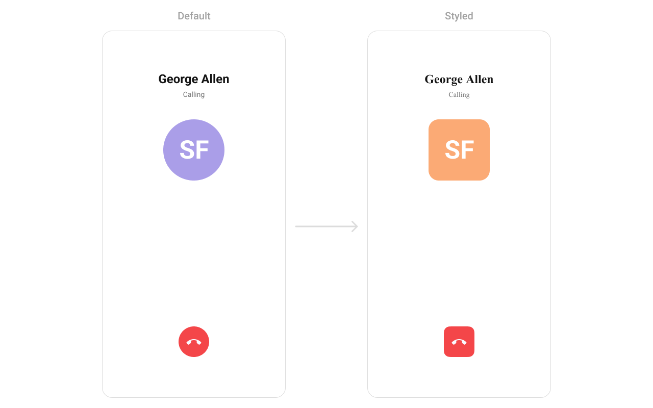
Outgoing Call
TheCometChatOutgoingCall component displays a status view for calls initiated by the user, showing the recipient’s details, call type, and call status (e.g., ringing or connecting).
- TypeScript
- JavaScript
Report incorrect code
Copy
Ask AI
import {
CometChatConversations,
CometChatMessageHeader,
CometChatThemeProvider,
CometChatUiKitConstants,
} from "@cometchat/chat-uikit-react-native";
import { CometChat } from "@cometchat/chat-sdk-react-native";
// other code
return (
<SafeAreaView style={{ flex: 1 }}>
<CometChatThemeProvider
theme={{
light: {
typography: {
heading1: {
bold: {
fontFamily: "TimesNewRoman-Bold",
},
medium: {
fontFamily: "TimesNewRoman",
},
regular: {
fontFamily: "TimesNewRoman",
},
},
},
outgoingCallStyle: {
avatarStyle: {
containerStyle: {
borderRadius: 8,
},
imageStyle: {
borderRadius: 8,
},
},
endCallButtonStyle: {
borderRadius: 8,
},
},
},
}}
>
{loggedIn && (
<View style={{ flex: 1 }}>
<CometChatConversations
style={{
containerStyle: {
display: messageUser || messageGroup ? "none" : "flex",
},
}}
onItemPress={(item: CometChat.Conversation) => {
if (
item.getConversationType() ==
CometChatUiKitConstants.ConversationTypeConstants.user
) {
setMessageUser(item.getConversationWith() as CometChat.User);
return;
}
setMessageGroup(item.getConversationWith() as CometChat.Group);
}}
></CometChatConversations>
{(messageUser || messageGroup) && (
<CometChatMessageHeader
user={messageUser}
group={messageGroup}
></CometChatMessageHeader>
)}
</View>
)}
</CometChatThemeProvider>
</SafeAreaView>
);
Report incorrect code
Copy
Ask AI
import {
CometChatConversations,
CometChatMessageHeader,
CometChatThemeProvider,
CometChatUiKitConstants,
} from "@cometchat/chat-uikit-react-native";
import { CometChat } from "@cometchat/chat-sdk-react-native";
// other code
return (
<SafeAreaView style={{ flex: 1 }}>
<CometChatThemeProvider
theme={{
light: {
typography: {
heading1: {
bold: {
fontFamily: "TimesNewRoman-Bold",
},
medium: {
fontFamily: "TimesNewRoman",
},
regular: {
fontFamily: "TimesNewRoman",
},
},
},
outgoingCallStyle: {
avatarStyle: {
containerStyle: {
borderRadius: 8,
},
imageStyle: {
borderRadius: 8,
},
},
endCallButtonStyle: {
borderRadius: 8,
},
},
},
}}
>
{loggedIn && (
<View style={{ flex: 1 }}>
<CometChatConversations
style={{
containerStyle: {
display: messageUser || messageGroup ? "none" : "flex",
},
}}
onItemPress={(item) => {
if (
item.getConversationType() ==
CometChatUiKitConstants.ConversationTypeConstants.user
) {
setMessageUser(item.getConversationWith());
return;
}
setMessageGroup(item.getConversationWith());
}}
></CometChatConversations>
{(messageUser || messageGroup) && (
<CometChatMessageHeader
user={messageUser}
group={messageGroup}
></CometChatMessageHeader>
)}
</View>
)}
</CometChatThemeProvider>
</SafeAreaView>
);
Call Button
TheCometChatCallButton Component initiates voice or video calls with a single click. It supports various customization options for button color and icon styles, making it adaptable to different screen layouts and themes. These components further enhance the versatility of CometChat UIKit, ensuring that all aspects of messaging and calling functionality are cohesive, user-friendly, and fully customizable.

- TypeScript
- JavaScript
Report incorrect code
Copy
Ask AI
import {
CometChatCallButtons,
CometChatThemeProvider,
useTheme,
} from "@cometchat/chat-uikit-react-native";
// other code
const theme = useTheme();
return (
<SafeAreaView
style={{ flex: 1, alignItems: "center", justifyContent: "center" }}
>
<CometChatThemeProvider
theme={{
light: {
callButtonStyles: {
audioCallButtonIconStyle: {
tintColor: theme.color.primary,
},
audioCallButtonIconContainerStyle: {
backgroundColor: theme.color.extendedPrimary100,
paddingHorizontal: theme.spacing.padding.p4,
paddingVertical: theme.spacing.padding.p2,
borderRadius: 8,
},
videoCallButtonIconStyle: {
tintColor: theme.color.primary,
},
videoCallButtonIconContainerStyle: {
backgroundColor: theme.color.extendedPrimary100,
paddingHorizontal: theme.spacing.padding.p4,
paddingVertical: theme.spacing.padding.p2,
borderRadius: 8,
},
},
},
}}
>
{loggedIn && <CometChatCallButtons></CometChatCallButtons>}
</CometChatThemeProvider>
</SafeAreaView>
);
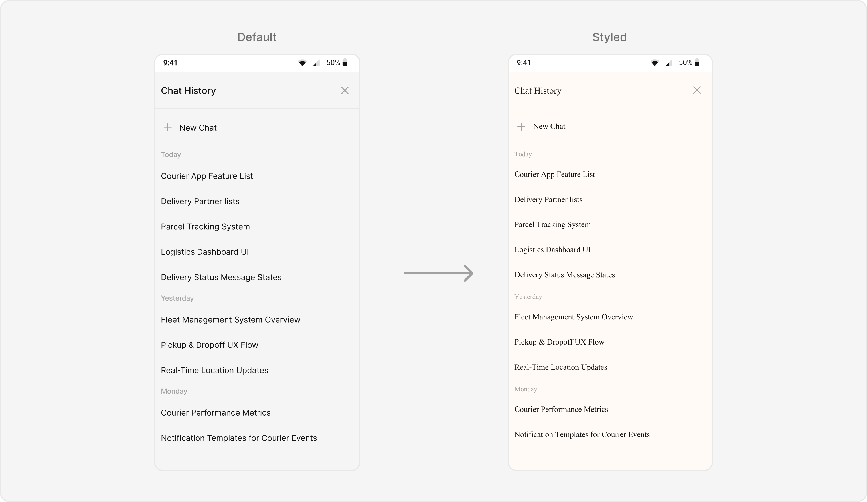
AI Assistant Chat History
TheCometChatAIAssistantChatHistory component displays the history of interactions with an AI assistant. It provides a seamless way to view past conversations, ensuring users can easily reference previous AI responses.
- TypeScript
- JavaScript
Report incorrect code
Copy
Ask AI
import {
CometChatAIAssistantChatHistory,
CometChatThemeProvider,
} from "@cometchat/chat-uikit-react-native";
// other code
return (
<SafeAreaView style={{ flex: 1 }}>
<CometChatThemeProvider
theme={{
light: {
typography: {
heading4: {
bold: {
fontFamily: "TimesNewRoman-Bold",
},
medium: {
fontFamily: "TimesNewRoman",
},
regular: {
fontFamily: "TimesNewRoman",
},
},
},
chatHistoryStyles: {
containerStyle: {
backgroundColor: '#FFFAF6',
},
headerStyle: {
backgroundColor: '#FFFAF6',
},
headerTitleStyle: {
color: '#F76808',
},
newChatButtonStyle: {
backgroundColor: '#FEEDE1',
},
newChatTextStyle: {
color: '#F76808',
},
sectionHeaderStyle: {
backgroundColor: '#FFFAF6',
},
sectionHeaderTextStyle: {
color: '#888888',
},
messageItemStyle: {
backgroundColor: '#FFFAF6',
},
messageTextStyle: {
color: '#333333',
},
},
},
}}
>
{loggedIn && (
<CometChatAIAssistantChatHistory
user={selectedUser}
onItemClick={(conversation) => {
// Handle chat history item click
console.log('Chat history item clicked:', conversation);
}}
onNewChatButtonClick={() => {
// Handle new chat button click
console.log('New chat button clicked');
}}
/>
)}
</CometChatThemeProvider>
</SafeAreaView>
);
Base Component
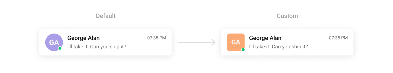
Avatar
TheCometChatAvatar Component is used across the UIKit to represent users, groups, or placeholders visually. This highly reusable component supports various shapes (circle or square), sizes, borders, and fallback icons, allowing complete design consistency for profile or group images.
- TypeScript
- JavaScript
Report incorrect code
Copy
Ask AI
import {
CometChatAvatar,
CometChatThemeProvider,
} from "@cometchat/chat-uikit-react-native";
import { ImageSourcePropType } from "react-native";
// other code
return (
<SafeAreaView
style={{ flex: 1, alignItems: "center", justifyContent: "center" }}
>
<CometChatThemeProvider
theme={{
light: {
avatarStyles: {
containerStyle: {
borderRadius: 8,
backgroundColor: "#FBAA75",
},
imageStyle: {
borderRadius: 8,
},
},
},
}}
>
{loggedIn && (
<CometChatAvatar
name="Some Name"
image={imageSource as ImageSourcePropType}
></CometChatAvatar>
)}
</CometChatThemeProvider>
</SafeAreaView>
);
Report incorrect code
Copy
Ask AI
import {
CometChatAvatar,
CometChatThemeProvider,
} from "@cometchat/chat-uikit-react-native";
// other code
return (
<SafeAreaView
style={{ flex: 1, alignItems: "center", justifyContent: "center" }}
>
<CometChatThemeProvider
theme={{
light: {
avatarStyles: {
containerStyle: {
borderRadius: 8,
backgroundColor: "#FBAA75",
},
imageStyle: {
borderRadius: 8,
},
},
},
}}
>
{loggedIn && (
<CometChatAvatar
name="Some Name"
image={imageSource}
></CometChatAvatar>
)}
</CometChatThemeProvider>
</SafeAreaView>
);
Status indicator
TheCometChatStatusIndicator visually represents user presence (online, offline, or custom states). It can be styled for different shapes, sizes, and colors to reflect your app’s visual preferences while maintaining clarity in conveying status information.

- TypeScript
- JavaScript
Report incorrect code
Copy
Ask AI
import {
CometChatStatusIndicator,
CometChatThemeProvider,
CometChatUiKitConstants,
} from "@cometchat/chat-uikit-react-native";
// other code
return (
<SafeAreaView
style={{ flex: 1, alignItems: "center", justifyContent: "center" }}
>
<CometChatThemeProvider
theme={{
light: {
statusIndicatorStyles: {
containerStyleOnline: {
backgroundColor: "#FFAB00",
},
},
},
}}
>
{loggedIn && (
<CometChatStatusIndicator
style={{
containerStyle: {
position: "relative",
borderRadius: 2,
},
}}
type={CometChatUiKitConstants.USER_ONLINE_STATUS}
></CometChatStatusIndicator>
)}
</CometChatThemeProvider>
</SafeAreaView>
);
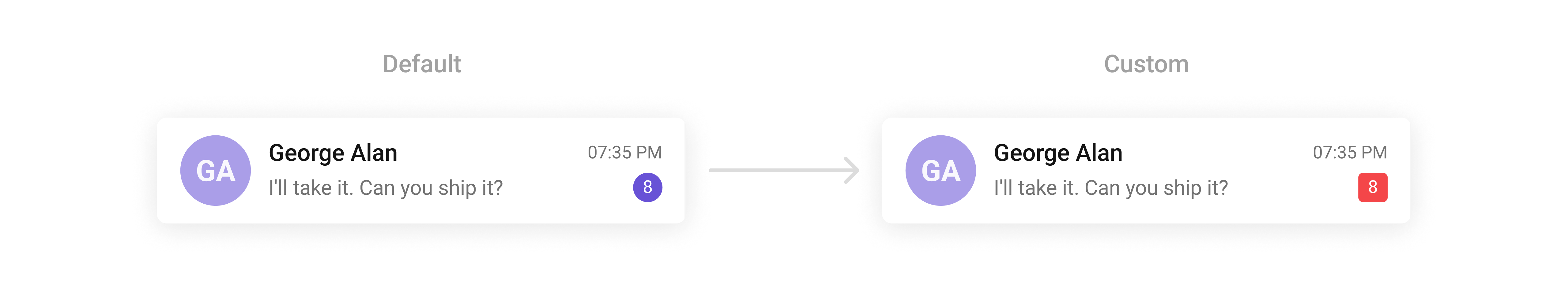
Badge
TheCometChatBadge Component displays notifications or counts, such as unread messages. It can be styled for background colors, border radius, text size, and colors, allowing you to create visually distinct indicators for different notifications.
- TypeScript
- JavaScript
Report incorrect code
Copy
Ask AI
import {
CometChatBadge,
CometChatThemeProvider,
useTheme,
} from "@cometchat/chat-uikit-react-native";
// other code
const theme = useTheme();
return (
<SafeAreaView
style={{ flex: 1, alignItems: "center", justifyContent: "center" }}
>
<CometChatThemeProvider
theme={{
light: {
badgeStyles: {
containerStyle: {
borderRadius: 4,
backgroundColor: theme.color.error,
},
},
},
}}
>
{loggedIn && <CometChatBadge count={244}></CometChatBadge>}
</CometChatThemeProvider>
</SafeAreaView>
);
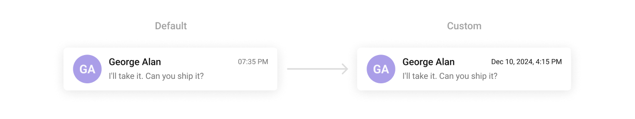
Date
TheCometChatDate Component formats and displays timestamps in conversation lists and message threads. It ensures time-related information is clear and consistent. Developers can customize its text appearance, alignment, and colors to fit various contexts.
- TypeScript
- JavaScript
Report incorrect code
Copy
Ask AI
import {
CometChatDate,
CometChatThemeProvider,
} from "@cometchat/chat-uikit-react-native";
// other code
return (
<SafeAreaView
style={{ flex: 1, alignItems: "center", justifyContent: "center" }}
>
<CometChatThemeProvider
theme={{
light: {
dateStyles: {
textStyle: {
color: "#141414",
},
},
},
}}
>
{loggedIn && (
<CometChatDate
timeStamp={Date.now()}
pattern={"dayDateTimeFormat"}
></CometChatDate>
)}
</CometChatThemeProvider>
</SafeAreaView>
);
Receipts
TheCometChatReceipts Component indicates message delivery and read statuses using intuitive icons. These can be styled for icon size, tint, and alignment, ensuring they remain clear and consistent with your app’s UI.

- TypeScript
- JavaScript
Report incorrect code
Copy
Ask AI
import {
CometChatReceipt,
CometChatThemeProvider,
CometChatUiKitConstants,
} from "@cometchat/chat-uikit-react-native";
// other code
return (
<SafeAreaView
style={{ flex: 1, alignItems: "center", justifyContent: "center" }}
>
<CometChatThemeProvider
theme={{
light: {
receiptStyles: {
readIconStyle: {
tintColor: "#FFAB00",
},
},
},
}}
>
{loggedIn && (
<CometChatReceipt
receipt={CometChatUiKitConstants.MessageReceipt.READ}
></CometChatReceipt>
)}
</CometChatThemeProvider>
</SafeAreaView>
);
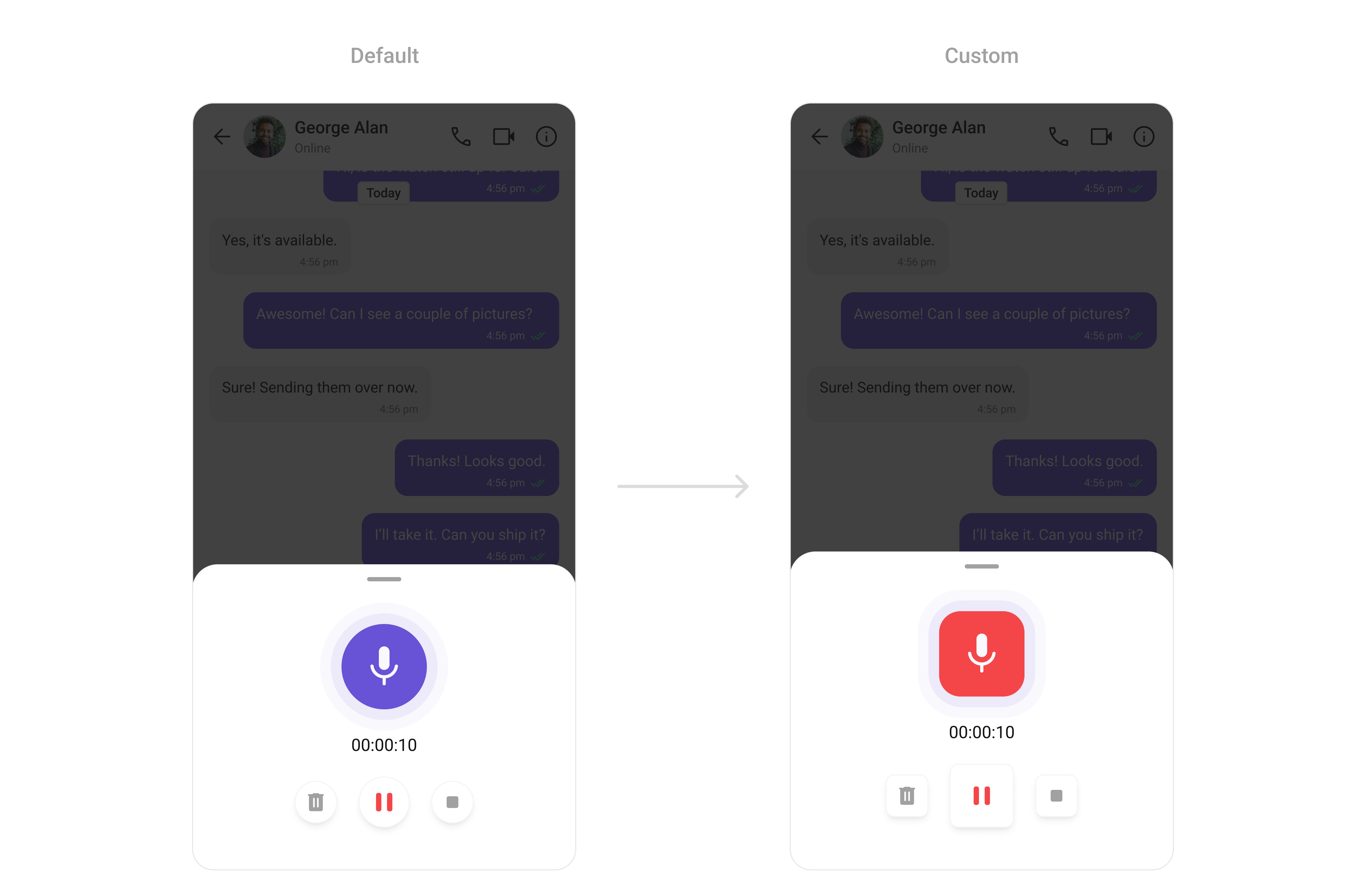
Media Recorder
TheCometChatMediaRecorder Component facilitates the recording of audio and video messages. It supports full customization of its recording controls, including button sizes, shapes, and colors, making it an integral part of your media-rich chat experience.
- TypeScript
- JavaScript
Report incorrect code
Copy
Ask AI
import {
CometChatMediaRecorder,
CometChatThemeProvider,
} from "@cometchat/chat-uikit-react-native";
// other code
return (
<SafeAreaView
style={{ flex: 1, alignItems: "center", justifyContent: "center" }}
>
<CometChatThemeProvider
theme={{
light: {
mediaRecorderStyle: {
animationStyle: {
innerAnimationContainerStyle: {
backgroundColor: "#EDEAFA",
borderRadius: 20,
},
outerAnimationContainerStyle: {
backgroundColor: "#F9F8FD",
borderRadius: 20,
},
animatedIconStyle: {
containerStyle: {
borderRadius: 20,
backgroundColor: "#F44649",
},
},
},
pauseIconStyle: {
containerStyle: {
height: 60,
width: 60,
borderRadius: 8,
alignItems: "center",
justifyContent: "center",
},
},
deleteIconStyle: {
containerStyle: {
borderRadius: 8,
},
},
stopIconStyle: {
containerStyle: {
borderRadius: 8,
},
},
},
},
}}
>
{loggedIn && <CometChatMediaRecorder></CometChatMediaRecorder>}
</CometChatThemeProvider>
</SafeAreaView>
);
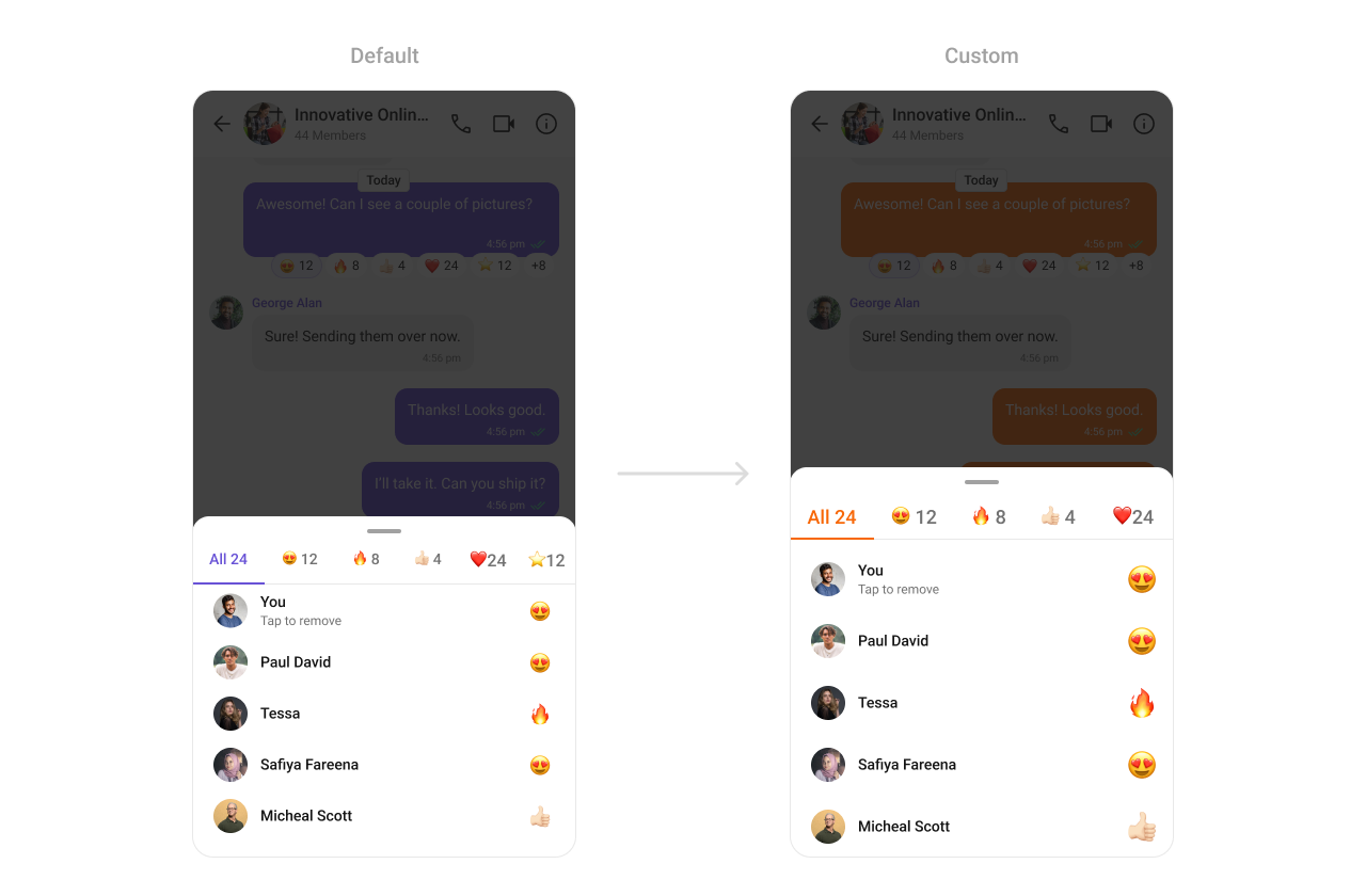
Reaction list
TheCometChatReactionList Component provides a visual representation of emoji reactions on messages. It supports customization for reaction sizes, spacing, and colors, enabling you to build an engaging and personalized messaging environment.
- TypeScript
- JavaScript
Report incorrect code
Copy
Ask AI
import {
CometChatReactionList,
CometChatThemeProvider,
} from "@cometchat/chat-uikit-react-native";
import { CometChat } from "@cometchat/chat-sdk-react-native";
// other code
return (
<SafeAreaView
style={{ flex: 1, alignItems: "center", justifyContent: "center" }}
>
<CometChatThemeProvider
theme={{
light: {
color: {
primary: "#F76808",
},
reactionListStyles: {
tabStyle: {
selectedItemStyle: {
borderBottomColor: "#F76808",
},
selectedItemTextStyle: {
color: "#F76808",
},
},
},
},
}}
>
{loggedIn && <CometChatReactionList message={messageWithReactions as CometChat.BaseMessage} />}
</CometChatThemeProvider>
</SafeAreaView>
);
Report incorrect code
Copy
Ask AI
import {
CometChatReactionList,
CometChatThemeProvider,
} from "@cometchat/chat-uikit-react-native";
// other code
return (
<SafeAreaView
style={{ flex: 1, alignItems: "center", justifyContent: "center" }}
>
<CometChatThemeProvider
theme={{
light: {
color: {
primary: "#F76808",
},
reactionListStyles: {
tabStyle: {
selectedItemStyle: {
borderBottomColor: "#F76808",
},
selectedItemTextStyle: {
color: "#F76808",
},
},
},
},
}}
>
{loggedIn && <CometChatReactionList message={messageWithReactions} />}
</CometChatThemeProvider>
</SafeAreaView>
);
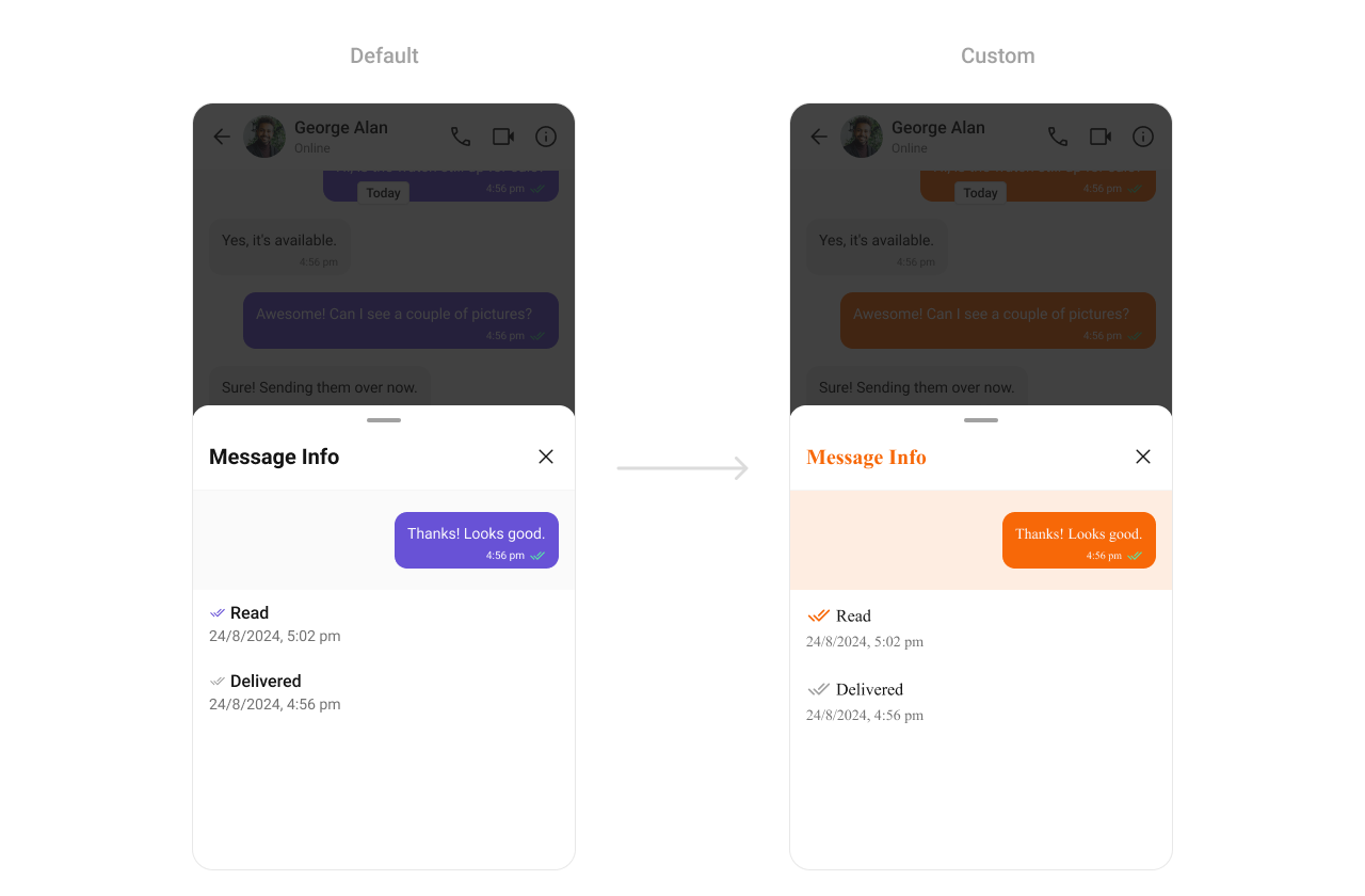
Message Information
TheCometChatMessageInformation Component displays metadata for messages, such as delivery timestamps, sender details, and read receipts. Customization options include text styles, colors, and alignment, making it adaptable to various app layouts.
- TypeScript
- JavaScript
Report incorrect code
Copy
Ask AI
import {
CometChatMessageInformation,
CometChatThemeProvider,
} from "@cometchat/chat-uikit-react-native";
import { CometChat } from "@cometchat/chat-sdk-react-native";
// other code
return (
<SafeAreaView style={{ flex: 1 }}>
<CometChatThemeProvider
theme={{
light: {
color: {
primary: "#F76808",
},
typography: {
heading4: {
bold: {
fontFamily: "TimesNewRoman-Bold",
},
medium: {
fontFamily: "TimesNewRoman",
},
regular: {
fontFamily: "TimesNewRoman",
},
},
},
messageInformationStyles: {
titleStyle: {
color: "#F76808",
},
messageBubbleContainerStyle: {
backgroundColor: "#FEEDE1",
},
},
},
}}
>
{loggedIn && (
<CometChatMessageInformation message={messageWithReactions as CometChat.BaseMessage} />
)}
</CometChatThemeProvider>
</SafeAreaView>
);
Report incorrect code
Copy
Ask AI
import {
CometChatMessageInformation,
CometChatThemeProvider,
} from "@cometchat/chat-uikit-react-native";
// other code
return (
<SafeAreaView style={{ flex: 1 }}>
<CometChatThemeProvider
theme={{
light: {
color: {
primary: "#F76808",
},
typography: {
heading4: {
bold: {
fontFamily: "TimesNewRoman-Bold",
},
medium: {
fontFamily: "TimesNewRoman",
},
regular: {
fontFamily: "TimesNewRoman",
},
},
},
messageInformationStyles: {
titleStyle: {
color: "#F76808",
},
messageBubbleContainerStyle: {
backgroundColor: "#FEEDE1",
},
},
},
}}
>
{loggedIn && (
<CometChatMessageInformation message={messageWithReactions} />
)}
</CometChatThemeProvider>
</SafeAreaView>
);
Bottom Sheet
TheCometChatBottomSheet component is a wrapper around the React Native Modal that provides a bottom sheet experience. While the Modal component offers basic functionality for displaying content in a popup overlay, the CometChatBottomSheet enhances this by offering features like smooth slide-in animations and a background overlay. It picks up most of its styling from the theme, ensuring a consistent design with minimal configuration. This component simplifies the implementation of bottom sheet interactions.
- TypeScript
- JavaScript
Report incorrect code
Copy
Ask AI
import {
CometChatBottomSheet,
CometChatThemeProvider,
} from "@cometchat/chat-uikit-react-native";
import { Dimensions } from "react-native";
// other code
return (
<SafeAreaView
style={{ flex: 1, alignItems: "center", justifyContent: "center" }}
>
<CometChatThemeProvider>
{loggedIn && (
<CometChatBottomSheet
style={{
minHeight: Dimensions.get("screen").height * 0.3,
}}
doNotOccupyEntireHeight={true}
>
{/*child component*/}
</CometChatBottomSheet>
)}
</CometChatThemeProvider>
</SafeAreaView>
);
Action Sheet
TheCometChatActionSheet component is a customizable action sheet designed to display a list of actionable options. Often integrated with the CometChatBottomSheet, it provides a structured and interactive menu for user actions.
- TypeScript
- JavaScript
Report incorrect code
Copy
Ask AI
import {
CometChatBottomSheet,
CometChatActionSheet,
CometChatThemeProvider,
} from "@cometchat/chat-uikit-react-native";
import { Dimensions } from "react-native";
// other code
return (
<SafeAreaView
style={{ flex: 1, alignItems: "center", justifyContent: "center" }}
>
<CometChatThemeProvider
theme={{
light: {
actionSheetStyle: {
optionsItemStyle: {
containerStyle: {
backgroundColor: "yellow",
},
},
},
},
}}
>
{loggedIn && (
<CometChatBottomSheet
style={{
minHeight: Dimensions.get("screen").height * 0.3,
}}
doNotOccupyEntireHeight={true}
>
<CometChatActionSheet
actions={[
{
id: "1",
title: "First Option",
onPress: () => {
console.log("First Option Pressed");
},
},
]}
></CometChatActionSheet>
</CometChatBottomSheet>
)}
</CometChatThemeProvider>
</SafeAreaView>
);
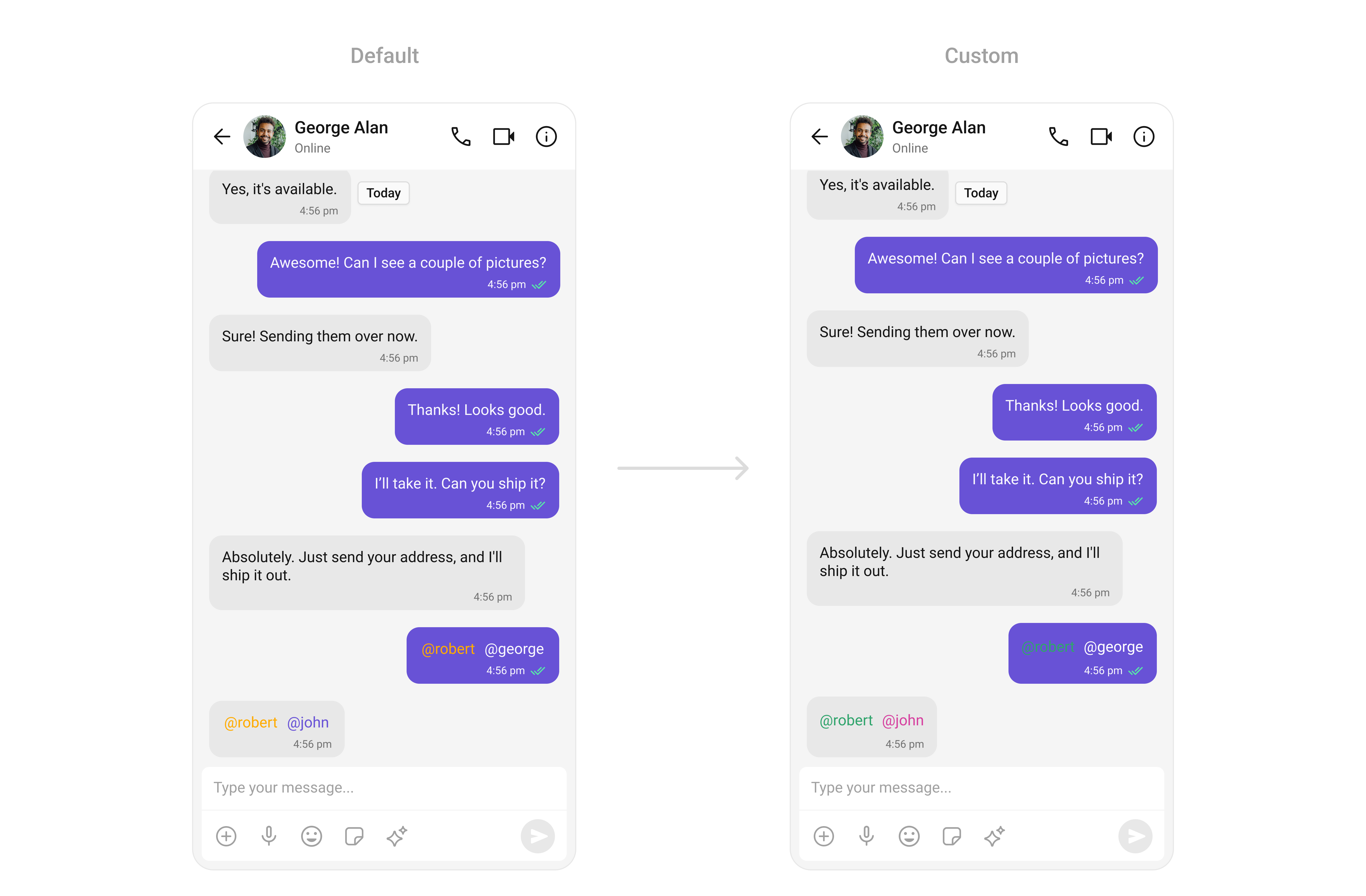
Mentions
TheCometChatMentions Component highlights referenced users or groups within messages. With customizable styles for text color and background, you can ensure mentions stand out clearly in chats while maintaining a cohesive visual theme.
- TypeScript
- JavaScript
Report incorrect code
Copy
Ask AI
import {
CometChatConversations,
CometChatMessageHeader,
CometChatMessageList,
CometChatMessageComposer,
CometChatThemeProvider,
CometChatUiKitConstants,
} from "@cometchat/chat-uikit-react-native";
import { CometChat } from "@cometchat/chat-sdk-react-native";
// other code
return (
<SafeAreaView style={{ flex: 1 }}>
<CometChatThemeProvider
theme={{
light: {
messageListStyles: {
incomingMessageBubbleStyles: {
textBubbleStyles: {
mentionsStyle: {
textStyle: {
color: "#D6409F",
},
selfTextStyle: {
color: "#30A46C",
},
},
},
},
outgoingMessageBubbleStyles: {
textBubbleStyles: {
mentionsStyle: {
textStyle: {
color: "#D6409F",
},
selfTextStyle: {
color: "#30A46C",
},
},
},
},
},
},
}}
>
{loggedIn && (
<View style={{ flex: 1 }}>
<CometChatConversations
style={{
containerStyle: {
display: messageUser || messageGroup ? "none" : "flex",
},
}}
onItemPress={(item: CometChat.Conversation) => {
if (
item.getConversationType() ==
CometChatUiKitConstants.ConversationTypeConstants.user
) {
setMessageUser(item.getConversationWith() as CometChat.User);
return;
}
setMessageGroup(item.getConversationWith() as CometChat.Group);
}}
></CometChatConversations>
{(messageUser || messageGroup) && (
<>
<CometChatMessageHeader
user={messageUser}
group={messageGroup}
></CometChatMessageHeader>
<CometChatMessageList
user={messageUser}
group={messageGroup}
></CometChatMessageList>
<CometChatMessageComposer
user={messageUser}
group={messageGroup}
></CometChatMessageComposer>
</>
)}
</View>
)}
</CometChatThemeProvider>
</SafeAreaView>
);
Report incorrect code
Copy
Ask AI
import {
CometChatConversations,
CometChatMessageHeader,
CometChatMessageList,
CometChatMessageComposer,
CometChatThemeProvider,
CometChatUiKitConstants,
} from "@cometchat/chat-uikit-react-native";
import { CometChat } from "@cometchat/chat-sdk-react-native";
// other code
return (
<SafeAreaView style={{ flex: 1 }}>
<CometChatThemeProvider
theme={{
light: {
messageListStyles: {
incomingMessageBubbleStyles: {
textBubbleStyles: {
mentionsStyle: {
textStyle: {
color: "#D6409F",
},
selfTextStyle: {
color: "#30A46C",
},
},
},
},
outgoingMessageBubbleStyles: {
textBubbleStyles: {
mentionsStyle: {
textStyle: {
color: "#D6409F",
},
selfTextStyle: {
color: "#30A46C",
},
},
},
},
},
},
}}
>
{loggedIn && (
<View style={{ flex: 1 }}>
<CometChatConversations
style={{
containerStyle: {
display: messageUser || messageGroup ? "none" : "flex",
},
}}
onItemPress={(item) => {
if (
item.getConversationType() ==
CometChatUiKitConstants.ConversationTypeConstants.user
) {
setMessageUser(item.getConversationWith());
return;
}
setMessageGroup(item.getConversationWith());
}}
></CometChatConversations>
{(messageUser || messageGroup) && (
<>
<CometChatMessageHeader
user={messageUser}
group={messageGroup}
></CometChatMessageHeader>
<CometChatMessageList
user={messageUser}
group={messageGroup}
></CometChatMessageList>
<CometChatMessageComposer
user={messageUser}
group={messageGroup}
></CometChatMessageComposer>
</>
)}
</View>
)}
</CometChatThemeProvider>
</SafeAreaView>
);